Calendly | Product
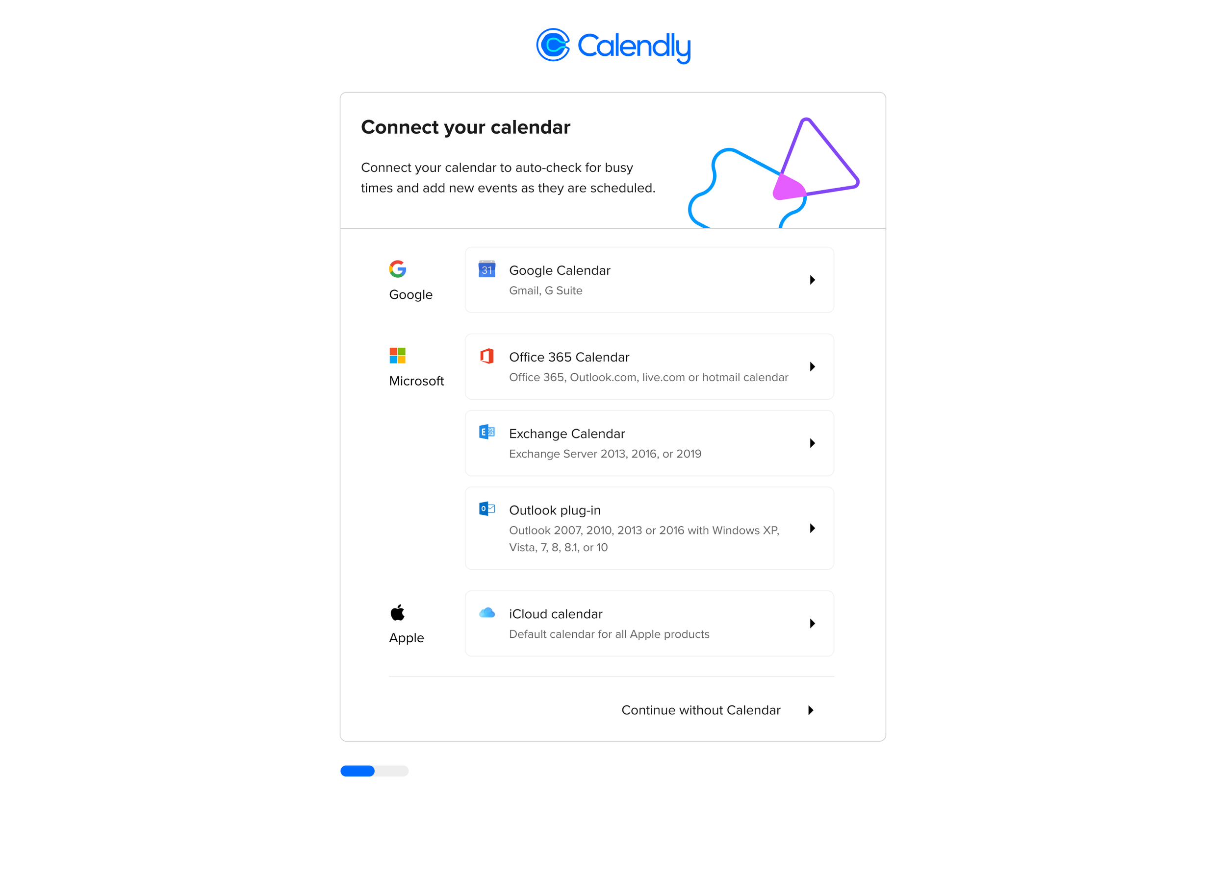
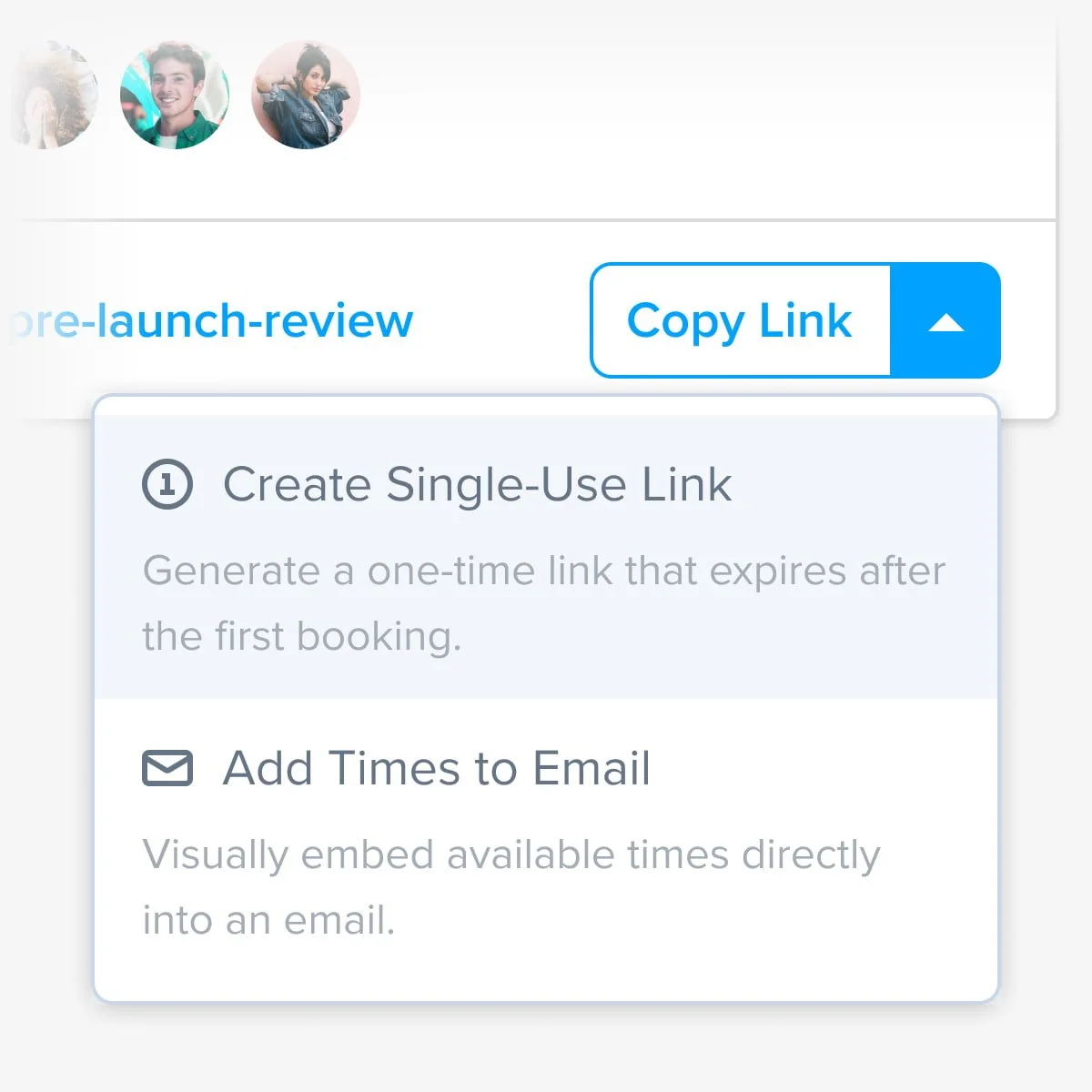
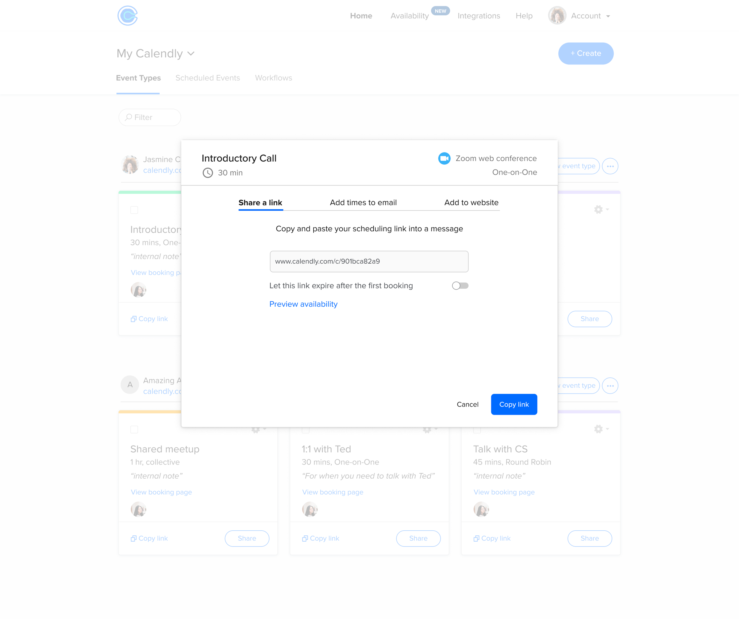
Calendly's sharing experience was broken in ways users felt but couldn't name. Research surfaced the real friction fast -- "I can't tell what times are being copied," "add to email is hard to find," "the times I send are already booked by the time my invitee opens the email." Three different sharing patterns that should have been one thing.
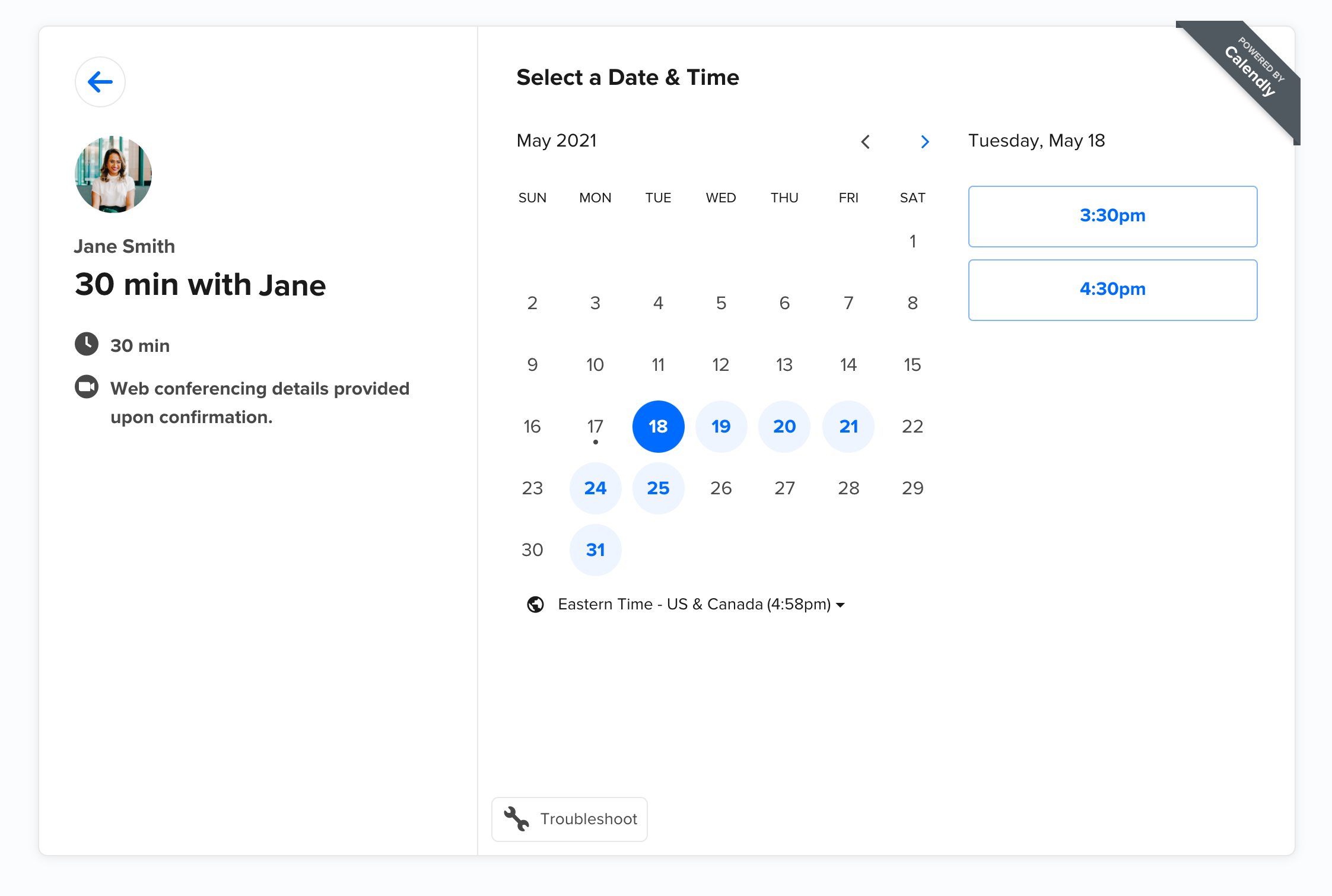
I redesigned the end-to-end sharing flow from the ground up: a unified component across three modes -- share a link, add times to email, and add to website -- that replaced inconsistent patterns with one coherent experience. Iterated through three rounds of design before shipping. Also redesigned the core booking page and product dashboard to align with the new brand system.
MY ROLE
Lead Product Designer. Owned UX research, product strategy, and end-to-end design. Shipped across web and mobile.
IMPACT
100M+ meetings scheduled on the platform annually
50,000+ companies using Calendly during tenure
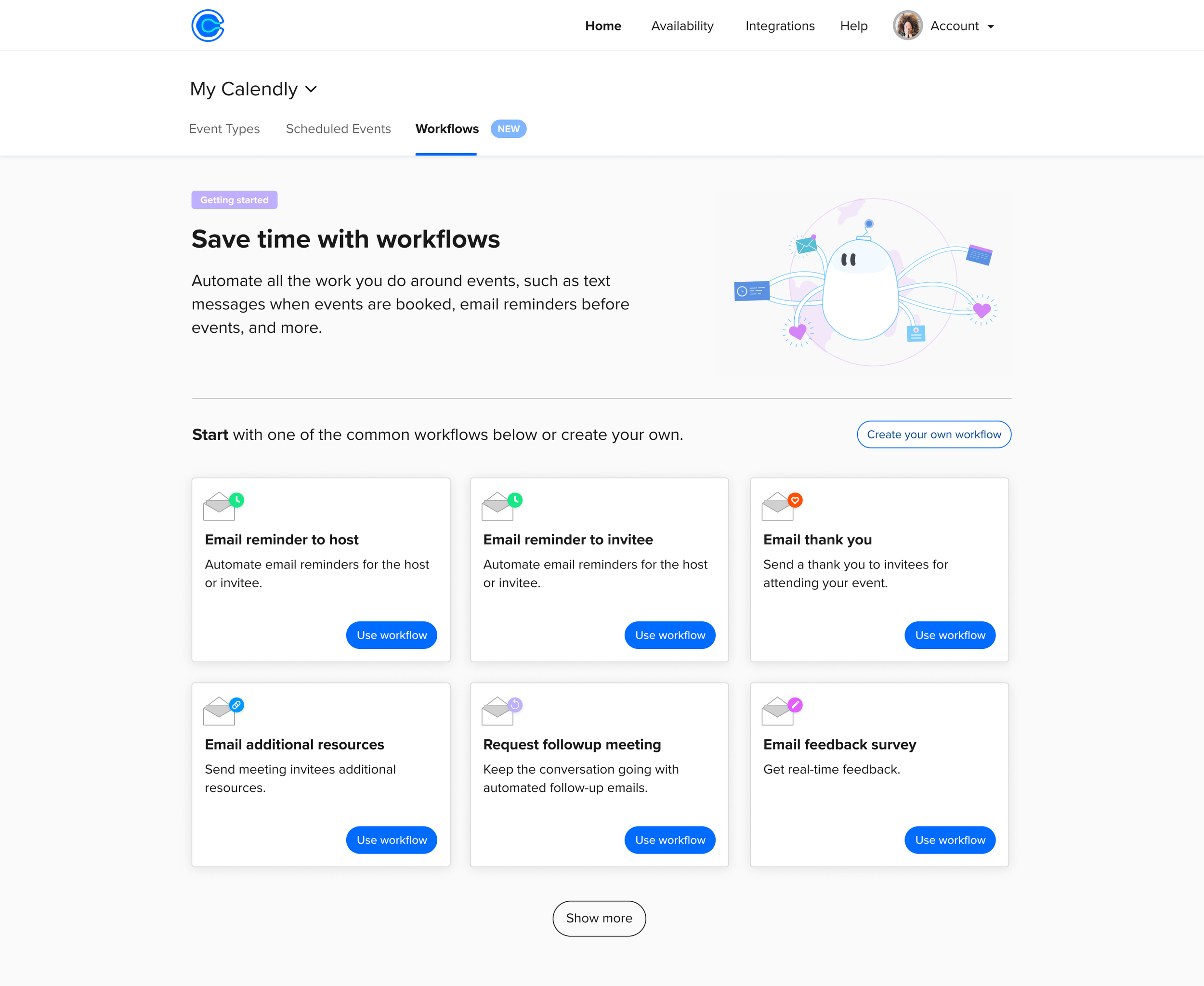
Event Types
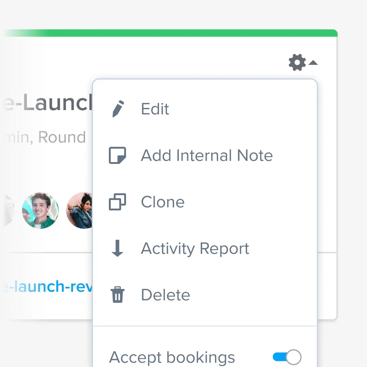
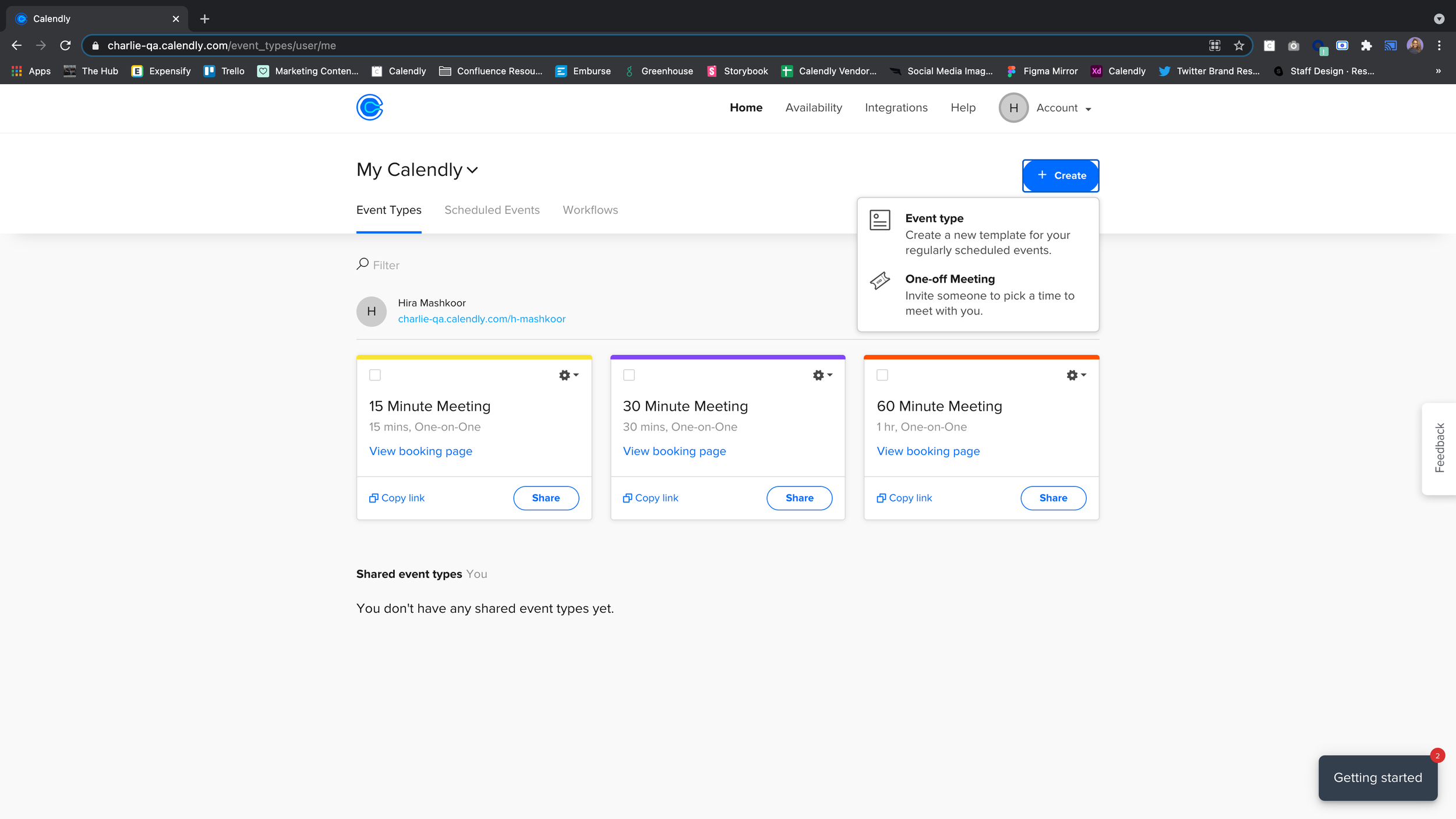
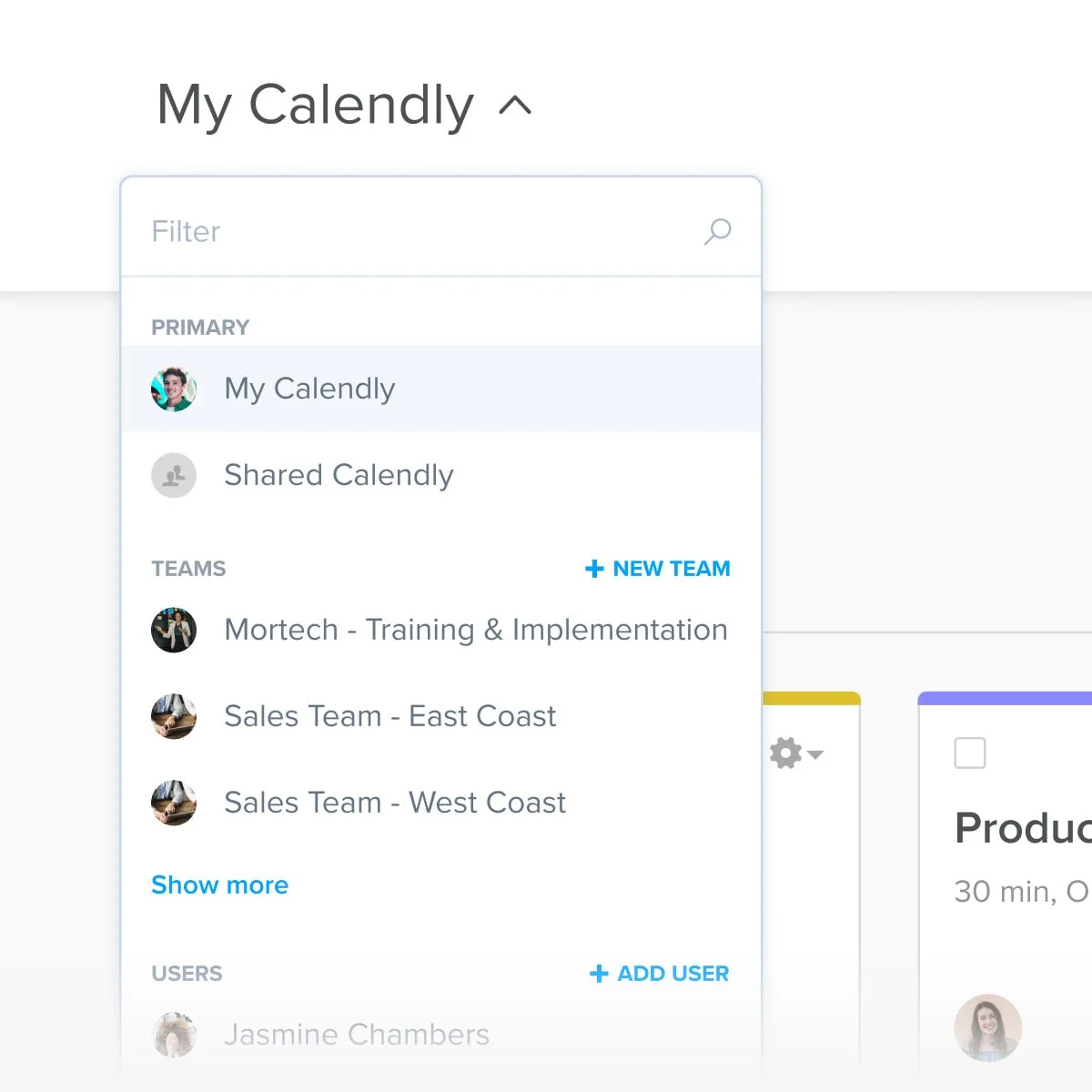
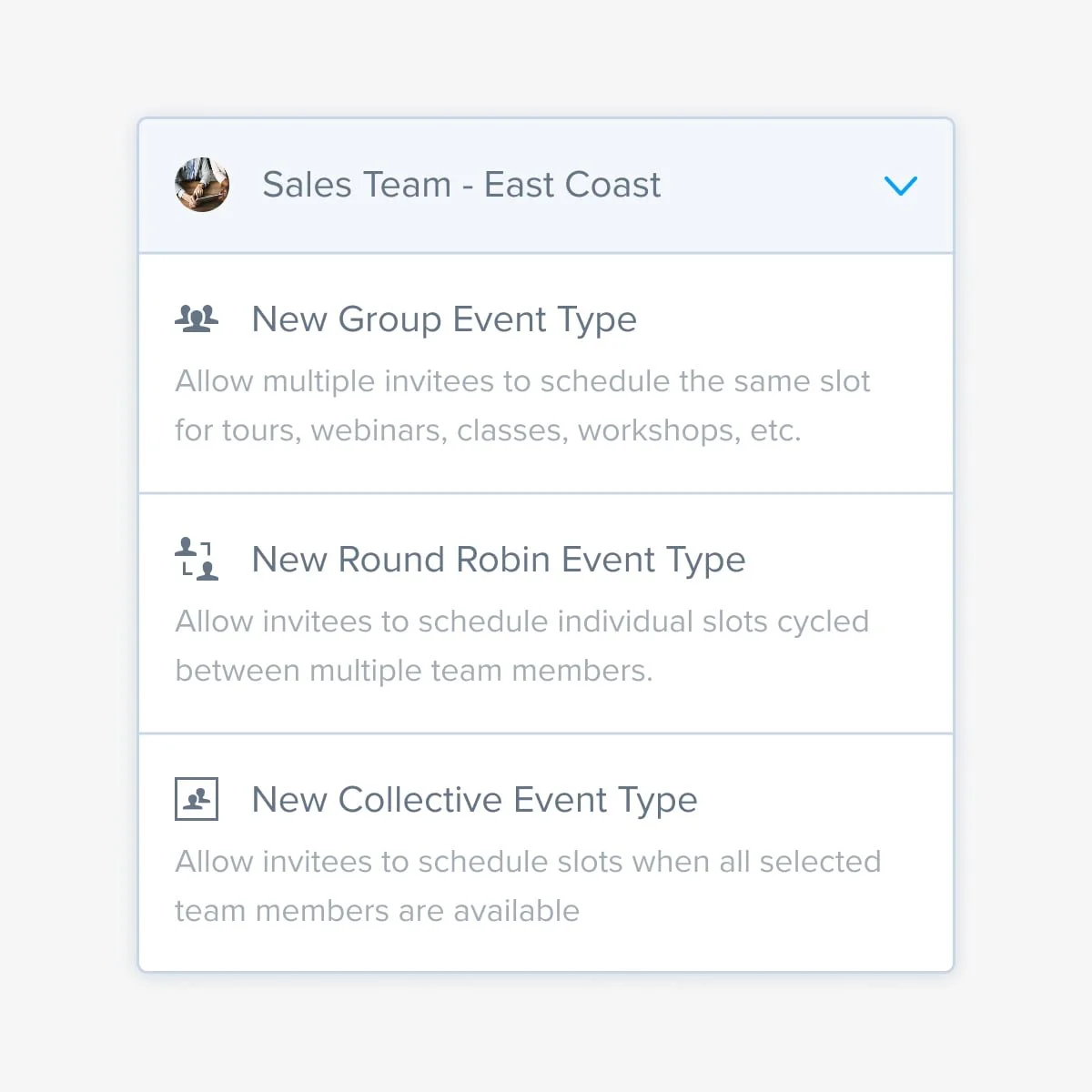
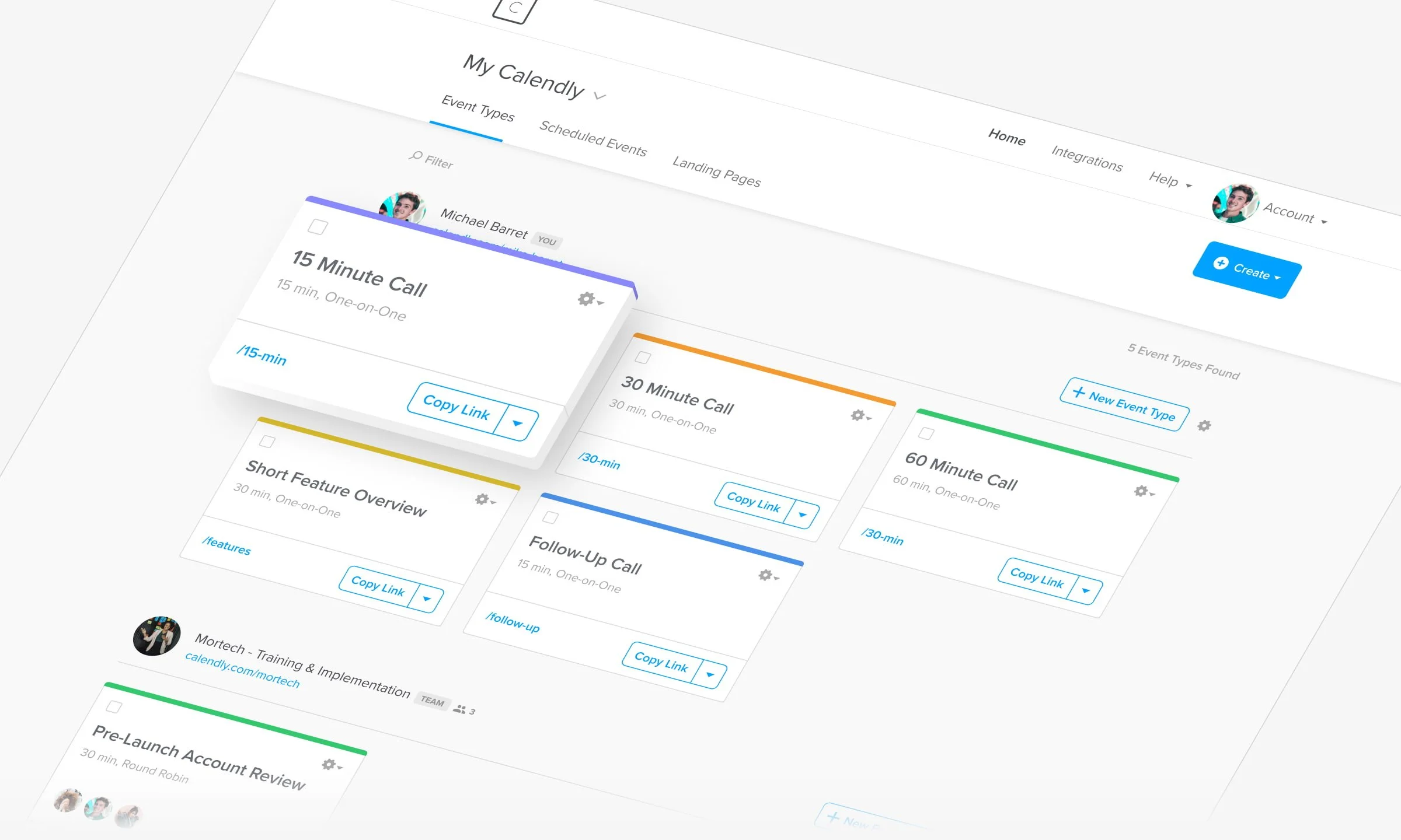
The new Event Types page is live, and it's probably the project I'm proudest of from my time at Calendly. It was the first effort where we wove research and testing through the entire cycle, not just at the start or the end. Getting there took years of pushing for this kind of process, so seeing it actually happen felt like a real milestone for the team.
It ended up being a textbook design cycle in the best way. We went through every stage, from needfinding to post-release user testing, which is honestly rare to pull off in full. Along the way I defined three core user archetypes (with a few subtypes) that are already shaping how the team talks about future work. And when we circled back to the same users after launch and heard how much it had improved their day-to-day, that was the moment it all felt worth it.
Note: This design is still in use as of July 2026
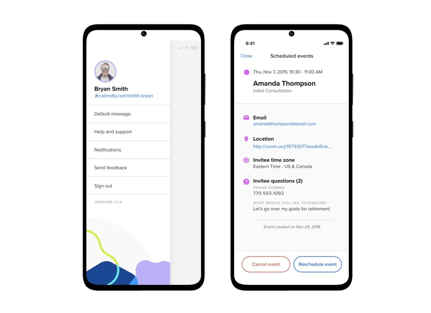
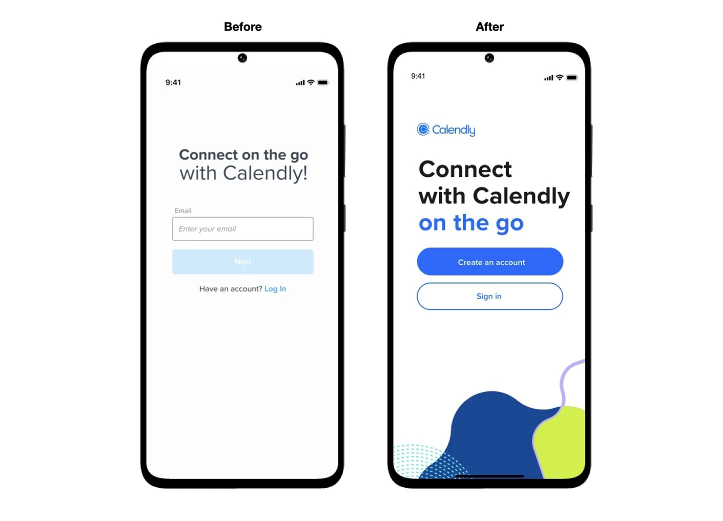
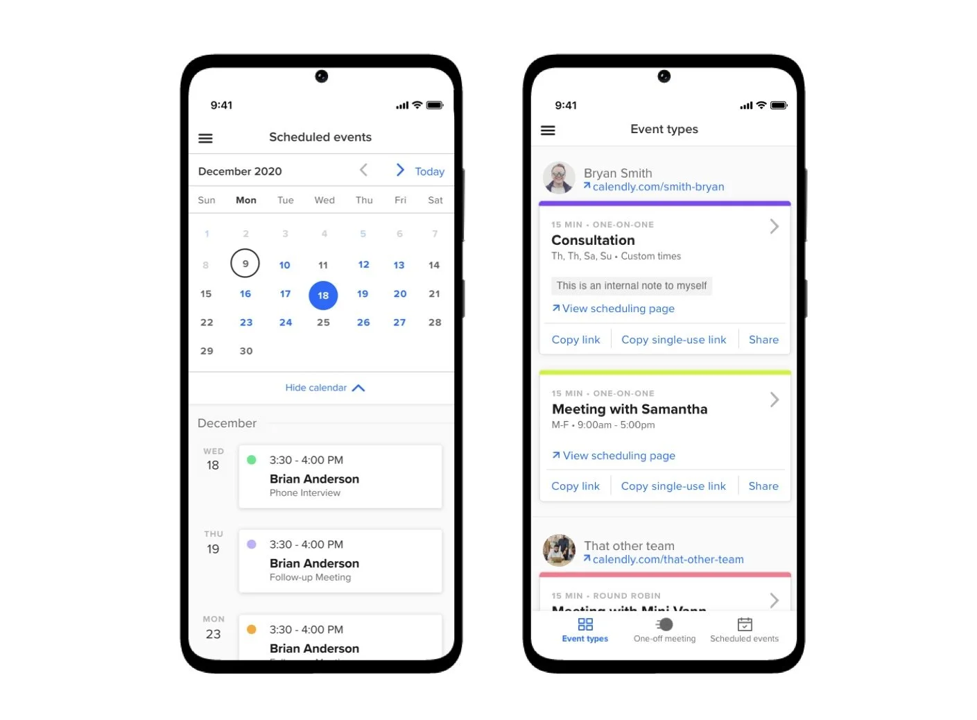
Mobile
Redesigning Calendly's mobile experience was as much about consistency as it was about mobile itself. The goal was to make sure the jump from web to mobile felt seamless, not like two different products wearing the same logo. Accessibility and scalability were front and center throughout, which meant we couldn't just design new mobile screens in isolation. We ended up updating the design system alongside the redesign itself, so every component we touched was built to hold up across both platforms going forward.